*This post may contain affiliate links for which I earn commissions.*
This image was created with AI to offer inspiration for your own decorating.
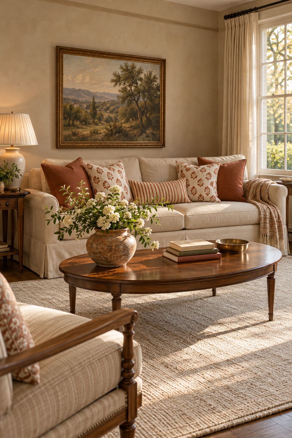
The appeal of this terracotta living room is in the small differences between its surfaces. Clay-colored cushions sit against oatmeal upholstery, a floral repeat brings the same color onto a cream background, and narrow stripes run across the lumbar pillow. On the coffee table, a rounded pottery vessel catches the afternoon light.
Brown furniture and a framed landscape give the setting its traditional character. The pale woven rug and softly draped throw keep it relaxed. You can adapt the idea through a cushion combination and one substantial vase, especially if your room already contains warm neutrals.
What Makes This Look Work
Terracotta is visible in solids and smaller marks
The plain cushions make the clay color unmistakable. The cream patterned pillows then repeat it in smaller floral shapes, with enough space around each motif to preserve the light background. The striped lumbar gives the group a different rhythm rather than adding another floral design.
This distinction prevents oatmeal, cream, and brown from blending into a single beige scheme. Terracotta does not need to cover a large wall to be effective, but it does need a clear place where the color is uninterrupted.
The pottery has a broader surface than the stems
The vase has a full rounded body and a mottled earthy appearance. Light across that surface makes the variation visible. Above it, pale flowers and small leaves spread outward with gaps between the stems, so the arrangement does not become a solid screen.
The vase sits toward the left end of the table. Its position matters because the larger body could feel obstructive at the center. The striped cushion and much of the sofa remain visible beyond it, while the books occupy a separate area to the right.
Traditional outlines contain the softer textures
The oval table, shaded ceramic lamp, and framed landscape provide recognizable furniture and decoration shapes. The woven-looking upholstery and rug can therefore feel relaxed without turning the room into a loose collection of rustic objects.
The pleated lampshade adds fine lines at a smaller scale than the cushion stripes. The throw contributes another soft repeat near the sofa arm. These details are enough; there is no need to introduce fringed wall hangings or heavily carved bohemian accessories to make the textures noticeable.
Key Pieces to Recreate the Look
Plain terracotta cushions
A muted clay or cinnamon tone gives warm neutrals a distinct accent. Choose a simple face so the color remains readable beside the more detailed printed pillows.
Terracotta floral block-print-style covers
Look for a small repeated motif on cream fabric, with clear gaps between the shapes. The image suggests the appearance of block printing, but it cannot establish how a real replacement fabric was made.
A cream and rust striped lumbar
A narrow rectangular pillow introduces lines across the center of the sofa. Keep its colors close to the floral covers while changing the pattern’s direction and scale.
A rounded earthy pottery vase
The vessel supplies the tabletop’s strongest texture. A substantial body with a stable base suits the look better than an extremely tall, narrow vase that would push the arrangement above the cushions.
A pleated-shade table lamp
A softly tapered pleated shade makes the lamp feel traditional without elaborate ornament. A restrained ceramic base works with the vase while allowing the shade to remain the finer detail.
A light textured throw
A cream or oatmeal throw brings softness to the sofa arm. A small quiet pattern is suitable, but avoid adding another large terracotta motif that would compete with the main cushions.
How to Style It at Home
Separate your existing warm neutrals
Look at the sofa, rug, and curtains together before buying accents. If they all have similar depth and texture, introduce terracotta through a clear solid fabric first. That gives the room a point of contrast you can evaluate easily.
Add the patterned covers after the solid color works. Their cream ground should remain lighter than the terracotta, even under evening light. If the pattern disappears, choose a more open repeat or a stronger difference between motif and background instead of adding more cushions.
Use sunlight to reveal rather than bleach
Place the vase where daylight can reach part of its body, then observe it at your room’s brightest time. Move it away from a strong beam if the highlights erase its surface detail. A slightly sheltered position can retain the warm feeling while making the texture easier to see.
Check the cushion colors from the doorway as well as beside the window. A fabric can look pale orange in direct sun and considerably browner farther into the room. Pick a shade you like in both conditions rather than planning the entire arrangement around one photograph.
Keep the vase substantial but the arrangement open
Start with a few branching stems and establish the outline before adding flower heads. Keep the densest part low enough that the sofa’s cushion mix remains visible. Wider stems should spread over the table, not toward the person sitting opposite.
If your coffee table is small, move the larger vessel to a side surface and use a smaller related vase on the table. Preserve the pottery-and-fabric relationship without forcing the exact display into a room where it makes conversation awkward.
Edit the surrounding finishes
Use brown furniture you already have, even if the pieces are not a matching set. Similar warmth is more useful than identical wood grain. Keep the art frame and small tabletop metal accent restrained so the pottery remains the most noticeable surface.
A quiet woven rug can carry the texture down to the floor. Make sure its edges sit securely under the seating group, and check that the chair can move without snagging. Let the throw drape where it is easy to reach rather than spreading it across the printed pillows.
Shop Similar Pieces
Check clay colors in real-room photos
Compare the exact selected variation with your sofa. Names such as rust, cinnamon, and terracotta cover a broad range; avoid assuming they will match one another across different listings.
Distinguish the print from the production method
If hand block printing matters to you, verify that claim in the listing. Otherwise, compare motif spacing, background warmth, and fabric care rather than paying for a technique the seller has not established.
Confirm the vase’s inside as well as its outside
Review the opening, weight, and water suitability. A weathered-looking decorative vessel may need a liner for fresh flowers, and a large exterior does not guarantee a useful interior opening.
Match a pleated shade to the lamp fitting
Check whether the shade uses a harp, clip, or another attachment. Compare its widest diameter with the side table so it does not crowd the sofa arm or nearby curtains.
Final Styling Tip
Put small protective pads beneath a rough pottery base before setting it on a polished table. They can protect the finish while keeping the vessel’s texture visible above the surface.