
*This post may contain affiliate links for which I earn commissions.*
This image was created with AI and is presented as decorating inspiration.
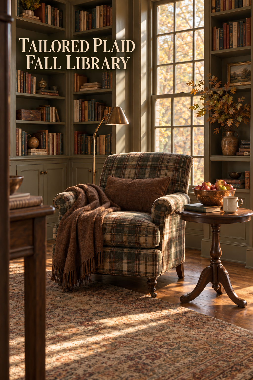
A room does not need pumpkins or leaf garlands to feel ready for fall. This library builds the season around a plaid reading chair, a chestnut throw, a copper bowl of apples, and afternoon light moving across old books and a faded rug. The mood is warm and traditional, but the arrangement remains useful long after autumn ends.
What Makes This Look Work
A Plaid Anchor Against Painted Shelving
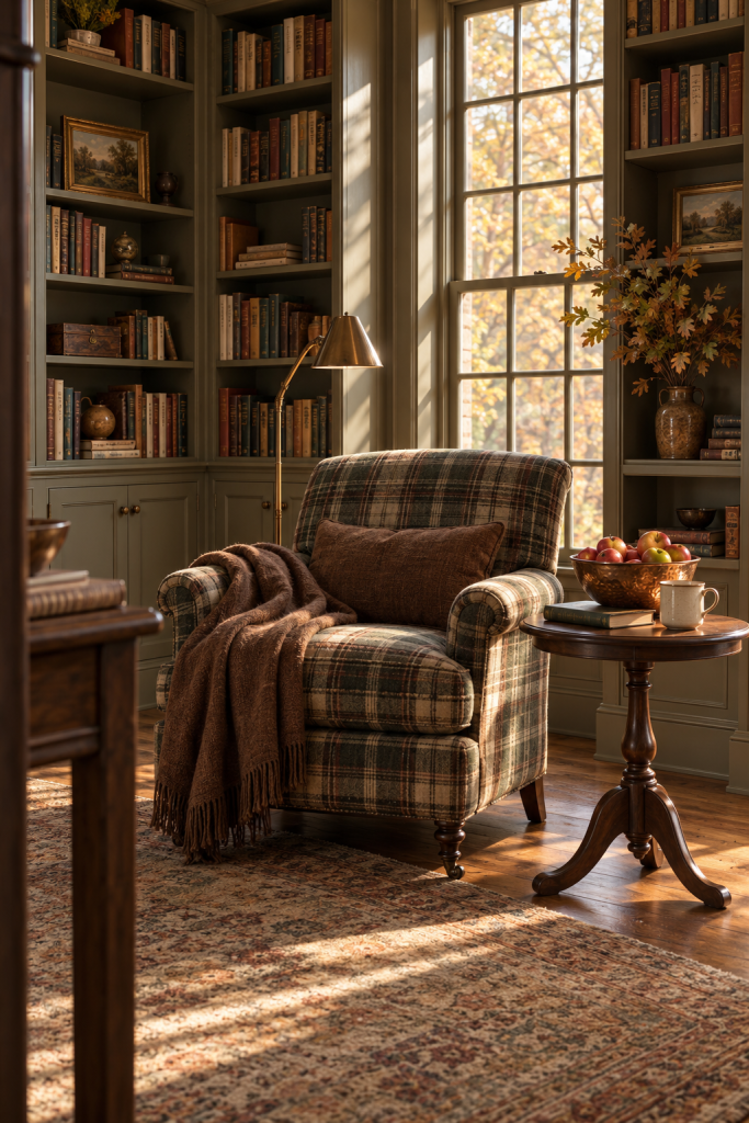
The chair is the visual anchor because its plaid gathers the room’s olive, tobacco, cream, and charcoal tones into one practical piece. Painted bookcases provide a quieter background than dark paneling, allowing the upholstery and sunlight to remain clear. The window adds a second vertical focal point and keeps the many books from making the corner feel closed in.
Seasonal Depth Through Natural Textures
Texture carries more of the seasonal message than literal fall motifs. Wool upholstery, a fringed throw, worn rug, aged paper, polished wood, and hammered copper each respond differently to the light. This approach alters the atmosphere in rooms with strong architecture without hiding the functional features that make the space useful.
An Intentional Tabletop Vignette
The small table holds only a few items, yet each has a distinct role. Apples introduce living red and green color, copper reflects the warm light, an open book repeats the library setting, and a plain mug makes the chair feel ready to use. Restrained oak branches echo the trees outside without spreading foliage across every shelf.
Grounding the Space with a Faded Rug
The rug quietly controls the transition between the chair and the floor. Its faded reds, mossy greens, and beige field connect the plaid upholstery to the oak boards without introducing a crisp new pattern. Because the rug extends beyond the chair grouping, it makes the reading corner feel intentional rather than like a single seat placed beside a bookcase.
Shelves Arranged for Visual Balance
Books provide useful color variation while remaining secondary. Muted spines, uneven heights, and a few horizontal stacks create a genuine library rhythm. Small framed landscapes and pottery occupy isolated shelf sections, leaving enough negative space for the foliage and window to remain distinct.
Key Pieces to Recreate the Look
Plaid Reading Chair
Choose a medium-scale chair with a muted tartan or windowpane plaid. Olive, brown, cream, and charcoal are easier to combine with existing wood and books than a bright multicolor pattern.
Chestnut Wool Throw
A solid brown throw gives the patterned chair a place for the eye to rest. Look for a soft brushed texture and fringe that hangs naturally rather than a heavy decorative border.
Copper Fruit Bowl
Hammered or softly patinated copper catches low sunlight without feeling shiny and new. A broad, shallow bowl keeps the apples visible from across the room.
Red-Green Apples
Real apples are an easy temporary accent; realistic faux fruit works for a longer display. Mixed coloring feels more natural than identical bright-red pieces.
Dark Wood Pedestal Table
A compact round table balances the chair’s square shape and keeps a drink within reach. Confirm that its top is wide enough for the bowl without crowding the edge.
Brown Stoneware Vase
A weighty, earth-toned vessel connects the foliage to the painted shelving. An irregular glaze suits the aged books and copper better than crisp white porcelain.
Simple Reading Lamp
A slim brass-toned floor lamp provides useful task light while echoing the warmth of the bowl. Keep the shade below eye level when seated.
How to Style It at Home
Position for Light, Reach, and Clearance
Start with comfort and function. Angle the chair toward both the window and the nearest light source, leaving enough room to walk around the front corner. Pull the side table close enough to reach easily, but not so close that the chair arm overlaps the copper bowl.
Pull Solid Tones from the Patterned Fabric
Use the plaid upholstery as a color guide rather than repeating the check elsewhere. Select one solid throw from the pattern’s warmest brown, then repeat a smaller amount of that tone in wood, pottery, or book spines. Avoid adding a plaid pillow so the chair pattern remains the sole graphic focus.
Keep the Pedestal Table Usable
Fill the copper bowl loosely so individual apples remain visible. Place the book and mug beside the bowl instead of underneath it to keep the surface practical. If the table surface is compact, use fewer apples and relocate the book to an adjacent chair-side shelf.
Edit Surrounding Shelves with Negative Space
Edit the surrounding shelves last. Keep most books upright, add a few horizontal stacks, and leave several calm gaps near the chair. One branch arrangement is enough to signal the outdoor season; trimming it below the top shelf will prevent it from competing with the window.
Align Sightlines from the Entryway
Evaluate the corner from the room entrance. The armchair should read first, followed by the bright window and the glowing copper bowl. If the side table blocks too much of the seat from this angle, slide it slightly forward rather than farther away, preserving both the open chair silhouette and practical reach.
Adapt the Setup for Freestanding Furniture
The same concept works without built-in millwork. Place a freestanding bookcase on one side of a window, position a reading lamp on the other, and use the plaid chair to visually bridge both elements. Placing a modest rug beneath the front chair legs provides a defined boundary without requiring a full room redesign.
Shop Similar Pieces
Choosing a Muted Plaid Reading Chair
Compare the scale of the check, the balance of olive and brown, and whether the chair fits the intended reading corner.
Look for a Chestnut Wool Throw
Look for solid warm brown, visible woven texture, and a size that can drape over one arm without covering the chair.
Find a warm Patinated Copper Bowl
Favor a shallow rounded profile and subdued patina rather than a bright mirror finish.
Shop Similar Red-Green Faux Apples
Choose varied red-green coloring, realistic stems, and slightly different sizes for a believable bowl display.
What to Look for in Brown Stoneware Vases
Match the deep earth tone, modest handles or rounded shoulders, and enough weight for tall branches.
Final Styling Tip
Choose one lasting patterned anchor, then build the fall mood with texture, natural color, and a few useful objects rather than themed clutter.