
*This post may contain affiliate links for which I earn commissions.*
This image was created with AI and is presented as decorating inspiration.
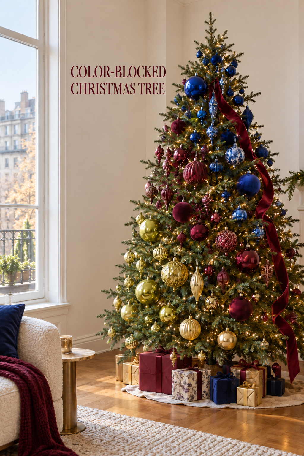
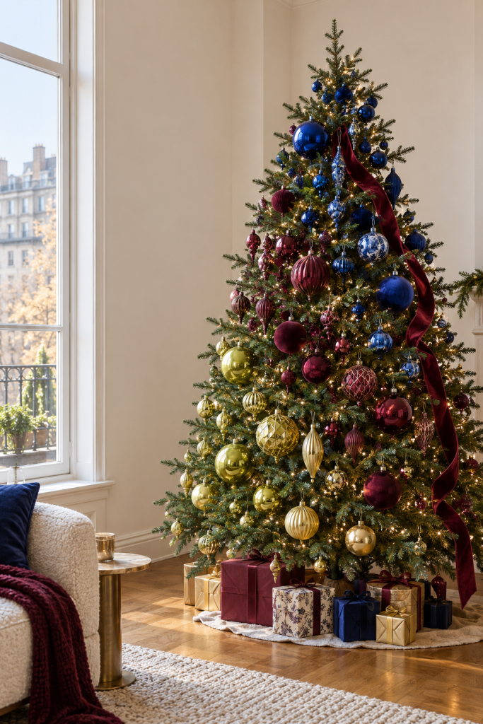
A Christmas tree beside a tall window can carry a bold palette without filling the whole room with color. In this AI-created image, cobalt ornaments concentrate toward the upper branches, burgundy gathers through the middle, and gold becomes stronger below. Small warm lights and a loose wine-colored ribbon connect the sections. The result feels collected even though the color placement is carefully planned.
What Makes This Look Work
Color blocks overlap instead of ending abruptly
The tree does not have three rigid horizontal stripes. Blue pieces travel downward in a few places, and burgundy and gold appear outside their main zones. That overlap makes the palette feel like a gradual change rather than separate trees stacked together. To adapt it, reserve most of each color for one area, then carry a few pieces into the neighboring area. Step back often: the effect should be clear across the room without looking mechanically divided.
The ribbon draws the eye through the ornaments
A burgundy ribbon follows an uneven path down the right side. It repeats one ornament color while adding a soft surface against the shiny balls. Rather than winding ribbon tightly around every branch, tuck a long length in several places and allow relaxed sections between those anchor points. Keep it clear of lights and make sure the top does not pull a branch out of shape.
A quiet room supports the strong palette
The pale wall, tall window and light floor leave the tree as the main subject. Wrapped gifts repeat selected colors at its base, while a neutral skirt provides a rest between packages and floor. In another room, the same idea could work with fewer gifts and a plainer base. The palette is the focal point; surrounding furniture need not echo every hue.
Key Pieces to Recreate the Look
Blue ornaments with varied finishes
Choose a family of rich blues rather than identical pieces. A few patterned or textured ornaments can sit among simpler reflective ones without changing the main color reading.
Wine and burgundy ornaments
These form the transition between cool blue and warm gold. Mix some smaller ornaments into gaps so the middle does not become a band of large balls.
Warm gold ornaments
Gold brightens the lower branches in the image. A soft champagne or antique finish can be easier to live with than a very bright yellow metallic.
A long flexible ribbon
Look for enough body to hold a loose curve but enough softness to tuck behind branches. Test a short section before cutting the full length.
Warm white tree lights
The small light points create continuity across all three color groups. Use lights rated for your tree and inspect cords and connections before decorating.
A restrained tree skirt
A light, simple base visually separates the ornaments from the floor. Its diameter should cover the stand without swallowing the nearby gifts or walkway.
How to Style It at Home
Sort by color and size first
Lay out the ornaments in three groups and set aside a few from each for overlap. Divide the large ones among zones before filling gaps with smaller pieces. This prevents one area from carrying all the visual mass and helps you see whether an existing collection is enough.
Light the tree before defining zones
Wrap or install the lights according to the tree and light manufacturer’s directions. Switch them on, then view the tree from the primary seat and from the doorway. A bright window can flatten the effect by day, so check the arrangement once more after dark.
Hang the focal pieces at staggered depths
Start with larger ornaments in the main color area of each zone. Place some closer to the trunk and others on outer branches, using secure hangers. Avoid lining up three large pieces at the same height. Add small crossover ornaments only after the broad color pattern reads well.
Add ribbon with breathing room
Begin near the top and guide the ribbon down one side in a few loose arcs. Tuck it at secure branch forks and leave areas of bare greenery visible. If a section obscures too many ornaments, shorten that arc rather than adding more ribbon elsewhere. Finish by editing the gifts at the base to repeat one or two of the tree colors.
Shop Similar Pieces
Compare blue finishes in the same light
Photos can make deep blue look almost black. Check buyer images, surface finish and pack contents to ensure the assortment gives useful variety.
Choose burgundy sizes strategically
Look for a mix that includes smaller fillers as well as a few focal ornaments. Check hanging hardware and breakability for your household.
Assess ribbon by width and wire
A wide wired ribbon creates firmer loops; an unwired fabric falls more softly. Match the behavior to the relaxed line you want and the strength of the branches.
Match lights to the tree
Check intended indoor use, strand length, power arrangement and light color. Consistent warm light matters more here than adding more bulbs.
Final Styling Tip
Keep a small box for unused ornaments beside the tree while you decorate. Removing a few pieces at the end often makes the color transitions clearer than filling the last visible gaps.