*This post may contain affiliate links for which I earn commissions.*
This image was created with AI to offer inspiration for your own home styling.
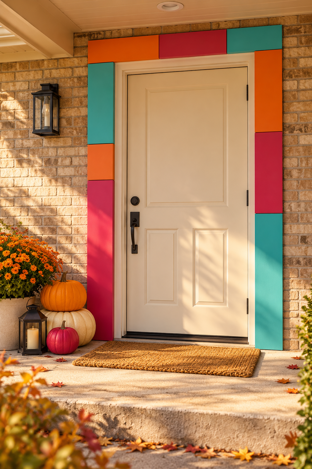
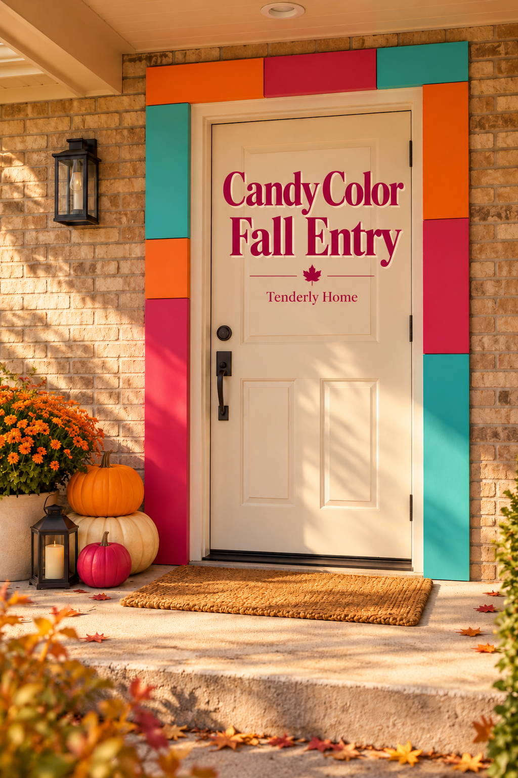
Orange, raspberry and turquoise panels turn this doorway into the main fall decoration. The cream door remains simple, and a small pumpkin grouping sits to one side with flowers and a lantern. It is a lively alternative to a wreath-centered porch, using the shape of the entrance itself to carry the color.
What Makes This Look Work
The color follows the doorway
Large rectangular blocks run up both sides and across the top of the opening. Their straight edges relate to the door’s rectangular shape, so the effect reads as one frame rather than scattered patches on the wall. The cream inner trim separates the vivid panels from the door and gives its handle and edges room to remain visible.
Unequal blocks keep the frame playful
The colors do not appear in matching positions on each side. Turquoise sits high on one side and low on the other, with orange and raspberry completing the sequence. That imbalance brings a retro graphic character, while the consistent panel width keeps the whole entrance from feeling disjointed.
A low harvest group connects the colors to fall
Orange and cream pumpkins sit together beside a smaller raspberry-colored pumpkin. The nearby flowers repeat orange in a softer form, and the dark lantern provides a quiet finish. This compact cluster gives the bright frame a seasonal context without covering the doorstep or demanding a second display on the opposite side.
Key Pieces to Recreate the Look
Removable decorative frame panels
The broad color blocks are the defining feature. A practical adaptation uses lightweight decorative panels selected for the actual setting and mounting surface, with their edges following the stationary surround rather than the moving door.
Paint in three contrasting colors
Burnt orange, raspberry and turquoise give the frame its candy-bright palette. A matte or softly reflective finish keeps the blocks readable in daylight without making the entrance look like illuminated signage.
Orange and cream faux pumpkins
Two contrasting pumpkin colors tie the graphic frame to familiar harvest decor. Rounded shapes soften the straight panels, and a stable low grouping keeps attention near the doorway rather than at eye level.
A small raspberry pumpkin accent
A painted or ready-colored faux pumpkin repeats the least traditional frame color at ground level. It works best as a small accent beside the orange and cream pieces rather than a replacement for every natural fall shade.
A low dark lantern
A compact lantern adds a dark outline beside the pumpkins. A battery candle is a practical option for this arrangement, provided both the lantern and candle are suitable for their actual exposure and placement.
A container of orange fall flowers
The flowering pot broadens the harvest grouping without introducing another dominant color. Choose a plant or artificial stems suited to your light and weather conditions rather than assuming the sheltered roof keeps all rain away.
A plain textured doormat
A simple mat gives the threshold a clear landing area. Its quiet surface lets the panels remain the strongest pattern and avoids adding a message or motif that would compete with the graphic frame.
How to Style It at Home
Map the frame on a photograph
Take a straight-on photo of your entry and sketch colored rectangles around the stationary surround. Keep their widths consistent, but vary where the colors begin and end. Include the overhead section so the design reads as a frame rather than two unrelated columns. Try more than one order before buying paint or panel material.
Use your own architecture as the guide. A narrow surround may call for slimmer blocks; a doorway with sidelights needs a plan that preserves their glass and access. The inspiration does not require rebuilding the entrance to match its proportions.
Resolve the panel attachment before decorating
Choose panel material, finish and removable mounting products as one compatible system for the actual surface, panel weight and exposure. Follow the manufacturers’ instructions and any property restrictions. Do not assume an indoor adhesive will work on outdoor brick or that a product described as removable will leave every painted surface undamaged.
Mount only where the door can operate normally. Check hinges, latch, seals, any closer and the full swing, and preserve access to locks, lights and doorbells. If no suitable attachment system is available, translate the blocks to freestanding decor beside the entry instead of improvising a fixing method above the door.
Keep the harvest pieces on one side
Begin with the largest pumpkin at the back of the grouping and place the smaller colored accent near its base. Use a stable arrangement that does not depend on balanced, loose pumpkins. A stacked look can be recreated with a purpose-made stable display or by placing separate pumpkins at slightly different heights on suitable supports.
Set the lantern where its base is flat and the candle remains accessible. Then position the flowers behind the lower objects, checking that the pot does not squeeze the approach to the handle. Avoid repeating the entire cluster on the other side simply to fill empty space.
Judge the entrance from the path
Step back to the route visitors actually use. The color blocks should be easy to read, and the handle and threshold should remain obvious. Remove small accessories that disappear from this distance. Check the mat for curling corners and leave the walking surface free of loose decor that could move underfoot.
View the entry after sunset as well. Existing lighting may change the apparent colors or cast strong shadows across the panels. Adjust the palette or lamp settings only within the equipment’s intended use; the display should not require additional wiring to make sense.
Shop Similar Pieces
Start with the panel system
Compare suitable lightweight panel materials and their finish requirements before choosing by color alone. Confirm how they can be cut, how edges need to be finished and what mounting system the manufacturer permits. When a listing lacks the necessary exposure or attachment information, treat it as a candidate requiring further checks.
Buy paint for the actual substrate
Check the product’s stated surface compatibility, preparation requirements and intended environment. Sample the colors beside the existing brick and door finish; online swatches cannot predict how orange or turquoise will look under your porch roof. Keep the original door coating out of this purchase decision if you are only finishing separate panels.
Compare pumpkins by stability and shape
Look at the bases and overall dimensions, not just a staged stack in a product photo. A broad cream pumpkin can anchor the group, while a smaller orange one supplies contrast. Hollow lightweight decor may need a protected placement, and outdoor suitability must come from the actual product information.
Check a lantern and candle together
Confirm the lantern’s usable interior height and the battery candle’s environment rating independently. A roof does not eliminate humidity or wind-driven rain. Choose a candle you can reach for battery changes without dismantling the display, and verify any timer feature from the listing rather than assuming it is included.
Final Styling Tip
Photograph the finished block order before taking the panels down. Label their backs with placement notes during storage so next year’s arrangement can be rebuilt without guessing which color segment belongs above each side.