*This post may contain affiliate links for which I earn commissions.*
This image was created with AI to offer inspiration for your own decorating.
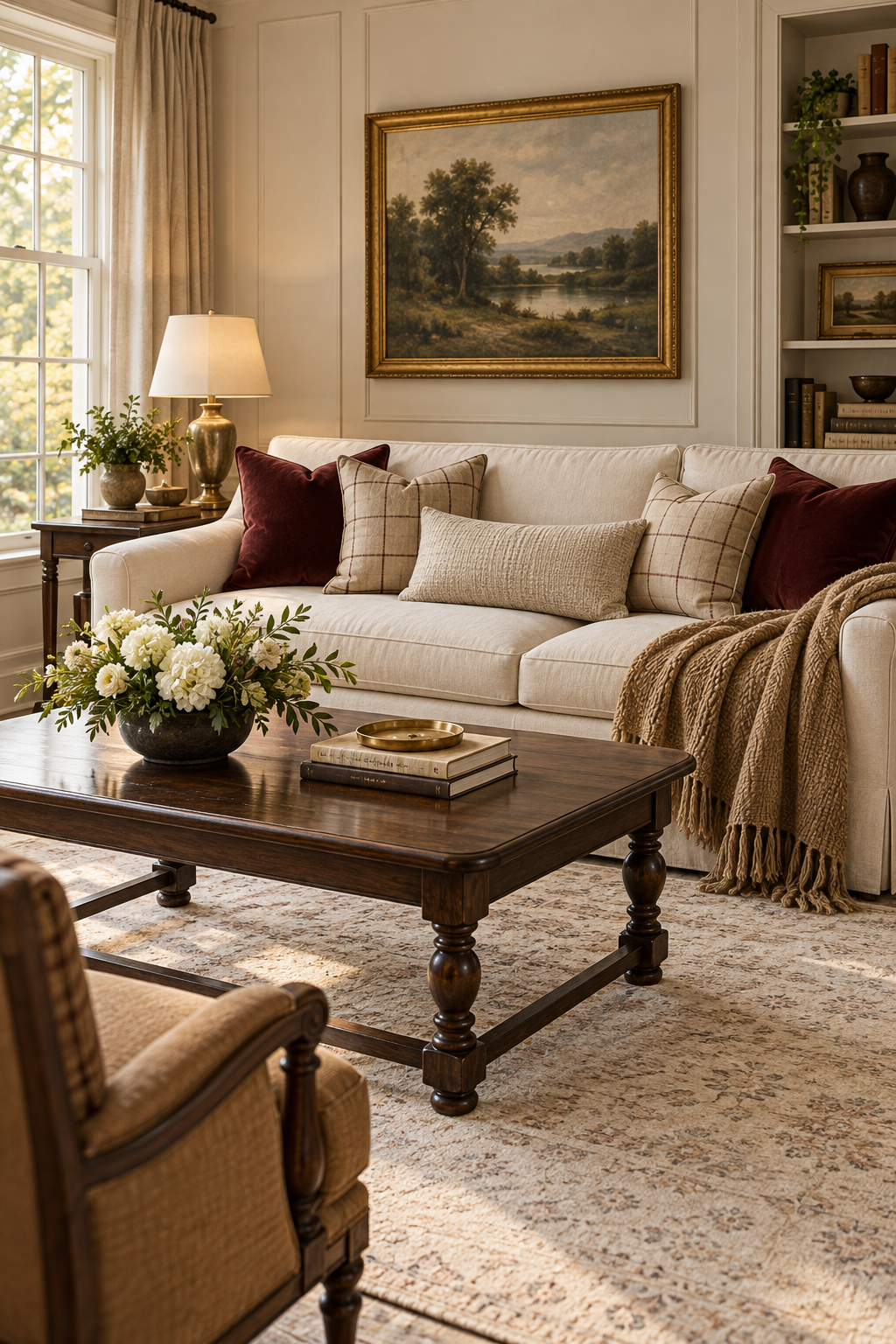
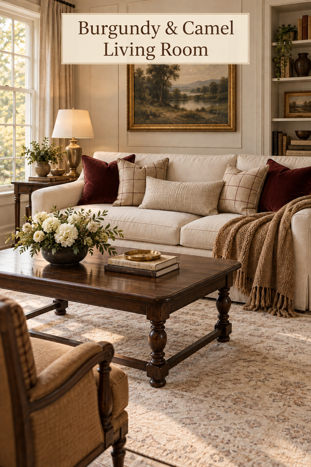
Deep burgundy can sit comfortably in a bright living room. Here, rich solid cushions sit against an ivory sofa, beside camel-toned check pillows and an oatmeal lumbar. A brown throw drapes over the arm, bringing a more relaxed texture to the tailored cushion arrangement.
The surrounding pieces keep the room familiar and inviting: a dark coffee table, a warm brass-tone lamp, a framed landscape, and a pale patterned rug. Cream flowers in a low dark bowl soften the tabletop. There are no holiday decorations to set the calendar, so the combination can stay in place beyond a particular season.
What Makes This Look Work
Burgundy stays concentrated on the sofa
The deepest red appears in the solid cushions near the ends of the sofa. That controlled placement makes the color easy to enjoy without darkening the entire room. Ivory upholstery surrounds it, and daylight from the window keeps the difference between the fabrics clear.
The check pillows contain fine darker lines on a much lighter ground. They bridge the red cushions and the brown throw without becoming another large block of deep color. The neutral lumbar provides a calm center, where the sofa can still look inviting from across the room.
The check has a different texture from the throw
The cushion pattern is open and orderly, with a woven-looking surface. The solid burgundy fabric appears smoother, while the throw has a thicker, more irregular texture and a long fringed edge. These differences make the sofa interesting even where the colors are close.
Keeping the check on the pillows gives it a clear boundary. The throw can then fall loosely over the arm without needing its own pattern. A second checked blanket would repeat the same idea and could make the seating feel more like a coordinated set.
The darker table leaves the flowers distinct
Cream blooms stand out against a dark rounded vessel and brown tabletop. The arrangement stays low, leaving the pillows and landscape readable above it. Books and a shallow gold-tone dish form a smaller group on the other side of the table.
The warm metal repeats at the lamp and picture frame. Because those pieces are separated around the room, the finish connects the furniture without creating a bright metallic cluster in one spot.
Key Pieces to Recreate the Look
Deep burgundy velvet cushions
Look for a wine-toned red with enough depth to contrast with ivory. A plain surface is useful here because the check and throw already supply plenty of detail.
Camel and cream check covers
A pale background and fine intersecting lines suit this room better than a heavy high-contrast buffalo check. Let the camel appear in the ground or lines without making the pillow as dark as the solid cushions.
An oatmeal lumbar pillow
A restrained textured rectangle gives the sofa a quiet middle. Choose a simple weave with no large tassels or competing motif so it can connect the other fabrics without drawing attention away from them.
A substantial brown throw
The pictured throw has a generous fall and visible fringe. A camel or medium brown version can bring warmth to a pale sofa, especially when the fabric has enough flexibility to settle naturally over the arm.
A low dark vessel
A rounded bowl-shaped vase supports the light flowers without introducing another pale object on the table. Look for a stable base and a finish that sits comfortably beside your existing wood furniture.
A brass-tone shaded lamp
A traditional rounded base and simple cream shade echo the warm frame above the sofa. The shade keeps the light gentle and prevents an exposed bulb from distracting from the fabrics.
How to Style It at Home
Start with the contrast your sofa can handle
Hold a burgundy cover against your upholstery before choosing the rest of the textiles. On a warm cream sofa, a wine red may feel softer than a purple-leaning shade. On a cool white sofa, the same cover can appear more dramatic.
Use the red near the outer parts of the seating group, then add the lighter checks in front. If the effect is too strong, reduce the number of red cushions instead of filling the center with more pillows. You should still see the sofa’s own fabric and be able to sit without clearing a pile of accessories.
Adjust the throw for use rather than symmetry
Let the blanket follow the sofa arm and stop where it will not drag underfoot. Keep a folded section within easy reach, but allow enough fabric to show its texture. The pictured drape is generous; your room may need a shorter fall if the arm sits beside a walkway.
Avoid pinning or tucking the blanket into a shape that has to be rebuilt after every use. A loose fold is more practical, and it preserves the comfortable feeling that makes this combination appealing.
Keep the table arrangement below the cushions
Choose a vessel before choosing the flowers. A low rounded container encourages a compact arrangement, whereas a tall neck can force the same stems upward. Set the vase near one end of the table and check it while seated.
Use cream flowers with a little green foliage, then leave the opposite area available for books and a small dish. If you need more daily landing space, remove the books before shrinking the bouquet into a tiny decoration. The flower group is the table’s main feature.
Balance the room beyond the red accents
A landscape with muted greens and brown tones can support the palette without repeating burgundy. If you have an existing painting, try the textiles beneath it before buying new art. Its frame may already supply all the warm metal the room needs.
Keep a pale rug under the seating group so the dark table does not merge with the floor. In a room with dark walls or flooring, use fewer dark accessories and retain a light lampshade. Check the arrangement after sunset, when velvet and brown fabrics may appear deeper than they do in daylight.
Shop Similar Pieces
Check the red variation carefully
Inspect customer photographs for the exact burgundy option. Confirm the closure and care instructions, and distinguish a cover-only listing from a filled pillow before comparing value.
Look for the full check repeat
A close-up may show attractive colors while hiding how large the squares are. Compare a full pillow photograph with your other cushions, including whether dark lines will disappear against burgundy.
Read throw dimensions as a drape
Measure from the top of your sofa arm to the desired lower edge, then allow fabric for a relaxed fold. Verify fiber content and washing instructions rather than assuming a textured brown blanket is wool.
Match a dark vessel to your flowers
Check the opening and actual height, not just the external width. If it is sold as a decorative bowl, confirm how stems will be supported and whether it is suitable for water before using fresh flowers.
Final Styling Tip
Brush or smooth the velvet pile in one direction before photographing the sofa. It can reduce accidental light patches, making the burgundy cushions read more consistently beside the checks.